

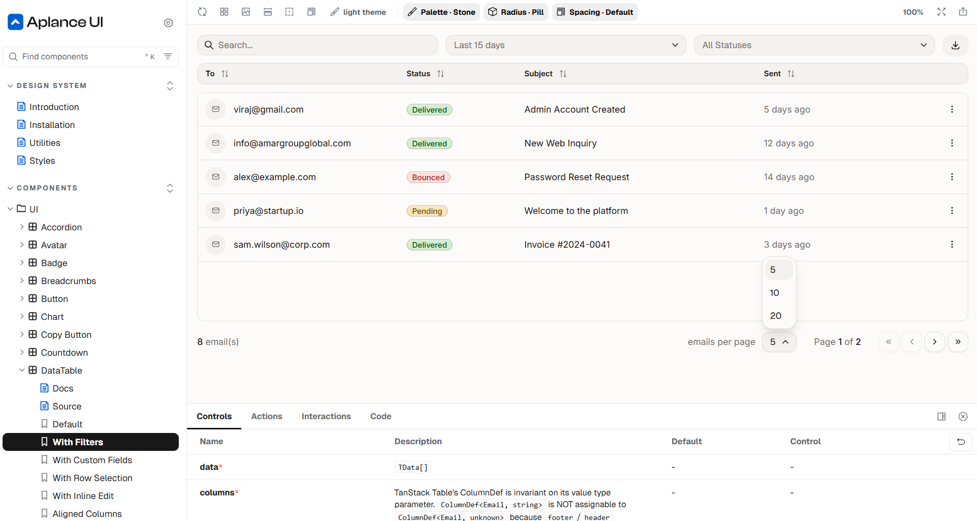
Aplance UI
React design system and UI library
A React component library built so our interfaces stay scalable, flexible and independent from UI-library lock-in.





We build design systems and frontend architecture — tokens, components and documentation — so interfaces stay consistent, accessible and easy to change. Our own Aplance UI library and postcss-token-utilities exist because we practice this on ourselves first.
Color, type, spacing and radius live as tokens, so consistency is structural instead of remembered.
Repeated UI becomes documented components with clear states, not copy-pasted variations.
The system stays visible and reviewable as products and teams grow around it.
Native CSS capabilities over heavy frameworks, so styles age well and stay yours.
AI-era interfaces bring new patterns — streaming responses, review states, sources and confidence. We design these into the component system so AI features feel native to the product instead of bolted on.
React design system and UI library
A React component library built so our interfaces stay scalable, flexible and independent from UI-library lock-in.
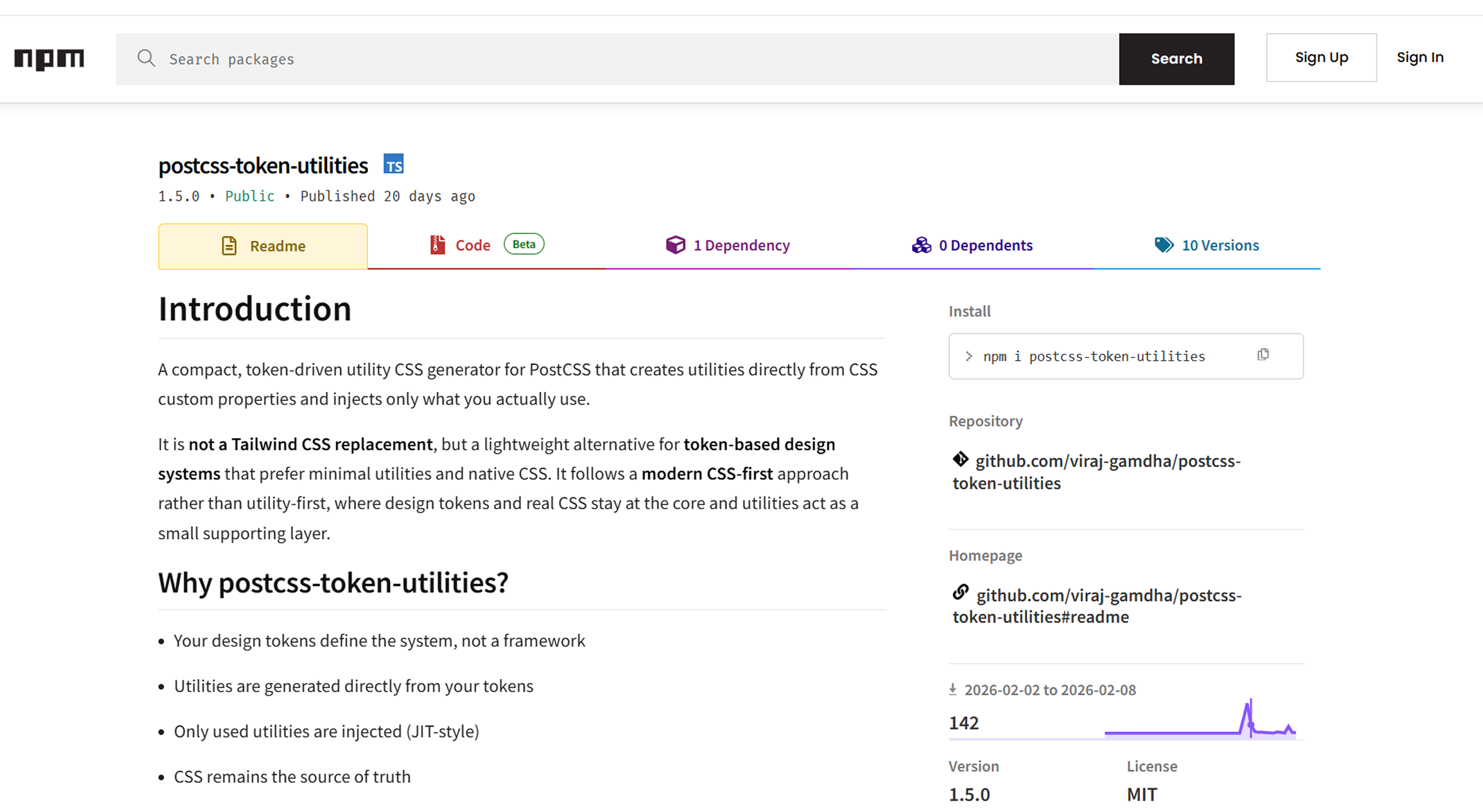
Utility classes generated from CSS tokens
A compact PostCSS plugin that generates useful utility classes from CSS custom properties and design tokens.



We turn them into a living system: tokens, components and documentation that keep the implementation faithful to the design as it evolves. Figma stays the design home; the code becomes its reliable mirror.
Our own React component and design library, documented in Storybook and built on modern CSS and headless primitives with zero vendor lock-in. It is the foundation we reuse and adapt across client work.
Usually, yes. We introduce tokens and shared components gradually, clean the highest-traffic screens first and let consistency spread release by release.