

We could not find a UI library that stayed simple, scalable and fully ownable across many products without eventually bringing framework assumptions or dependency weight with it.
Aplance ecosystem
Aplance UI
React design system and UI library
A React component library built so our interfaces stay scalable, flexible and independent from UI-library lock-in.
Type
Design system
Sector
Aplance ecosystem
Kind
Aplance ecosystem
What we built
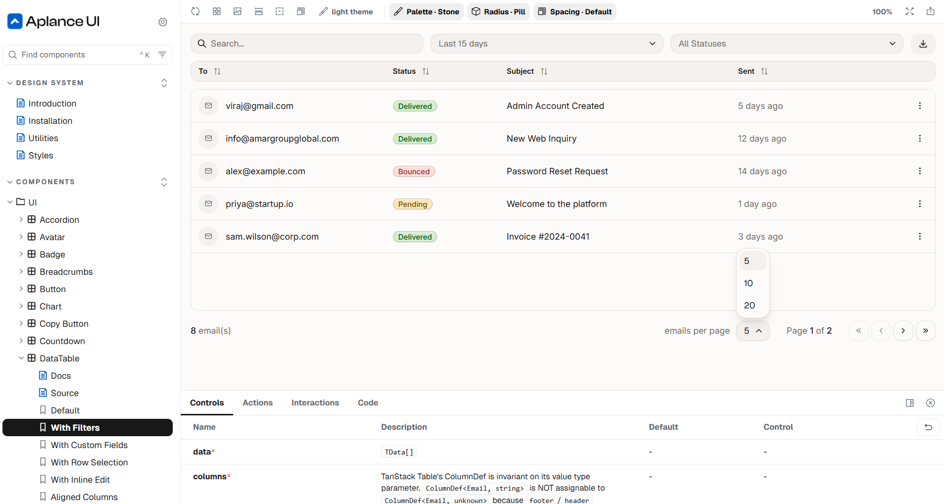
We built Aplance UI because the existing choices did not feel ownable enough for the way we work. Libraries like shadcn made non-vendor-lock-in popular, but many setups still accumulate internal dependencies, styling assumptions and scaling friction over time. Aplance UI is our own React component and design library, built from the ground up with modern CSS, headless primitives and component-based architecture instead of depending on a framework-first styling stack.
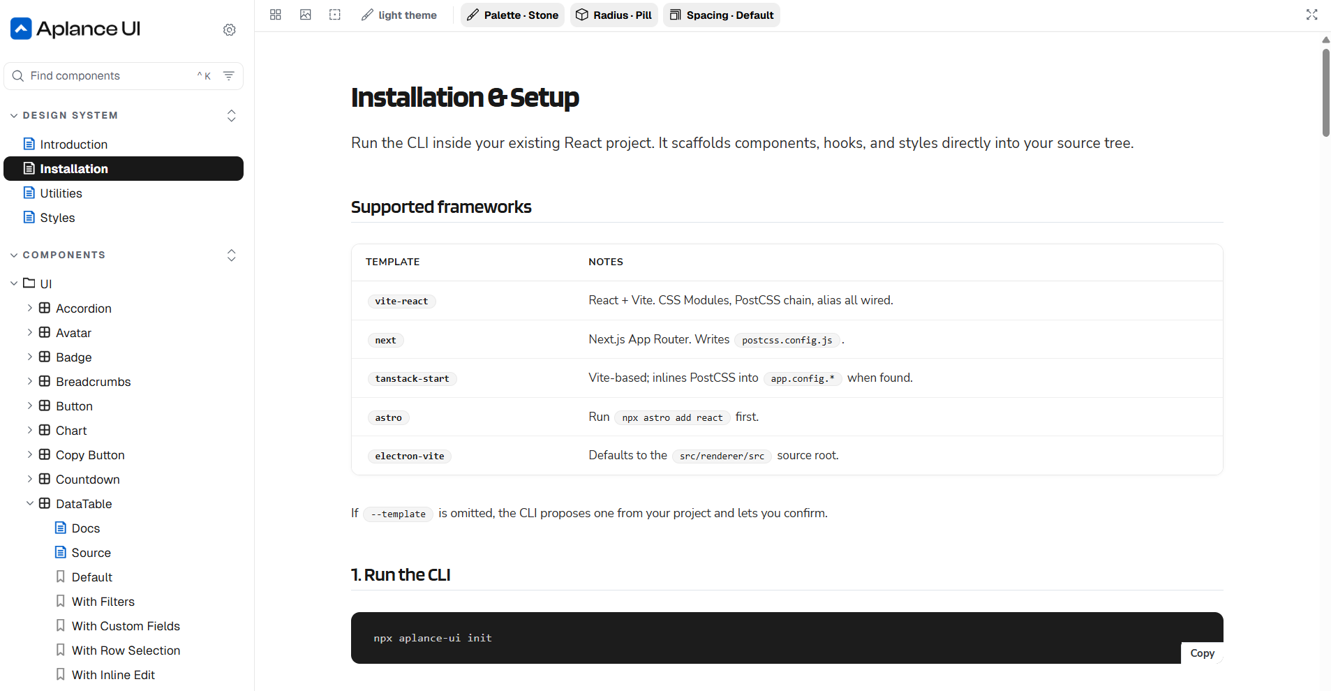
We created Aplance UI as a zero vendor-lock-in React system: documented in Storybook, designed around native CSS capabilities and flexible enough to pair with our own token utilities.
Together with postcss-token-utilities, it gives us a self-sufficient interface foundation that can grow without depending on the churn of UI-library trends.
Details
No vendor lock-in
Components are designed around React, modern CSS and headless primitives, not a styling framework that has to own the whole project.
Built for scale
Storybook keeps component states, design rules and implementation details visible as products and teams grow.
Works with our tokens
The system pairs with postcss-token-utilities so design tokens, components and utilities stay under our control.